The Opportunity
Finding the Right Moment
The business needed ways to increase average order value. Meanwhile, sitting on the buy it again roadmap was a future phase: a redesigned minibasket that would give users reasons to add more before checkout.
The proposal had two parts.
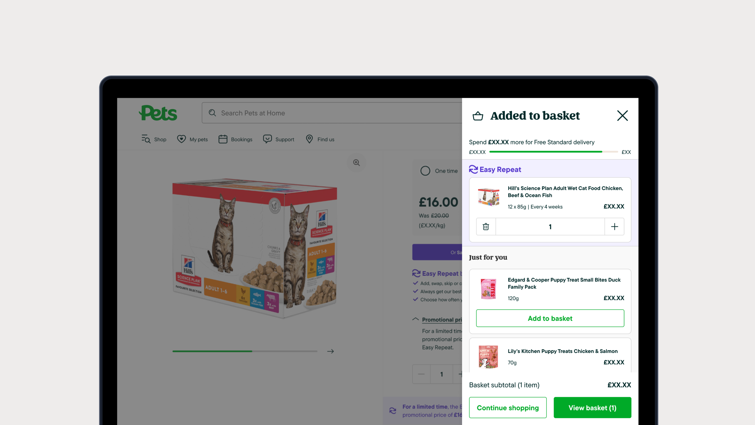
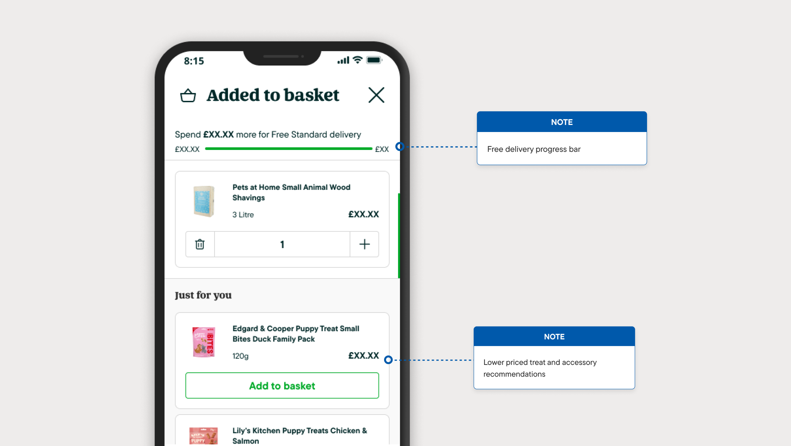
First, a free delivery progress bar. Users would see exactly how far they were from the threshold. Clear, simple, motivating.
Second, product recommendations surfaced at the moment of commitment. When someone adds to their basket, they're already in buying mode. Show them something relevant and you've got a natural path to a bigger order.
The timing was right. I proposed pulling this work forward.
The Question
Interaction Details Matter
The free delivery bar was straightforward. Show progress, update it when items are added. Users understood it immediately and it was well received in testing.
The recommendations were more complex. When a user adds a recommended product from within the modal, what should happen? Should the product move somewhere? Should they be able to change the quantity? What layout works best?
These details matter. Get them wrong and you create confusion instead of conversions.
AI-Assisted Prototyping
Building Fast, Testing Faster
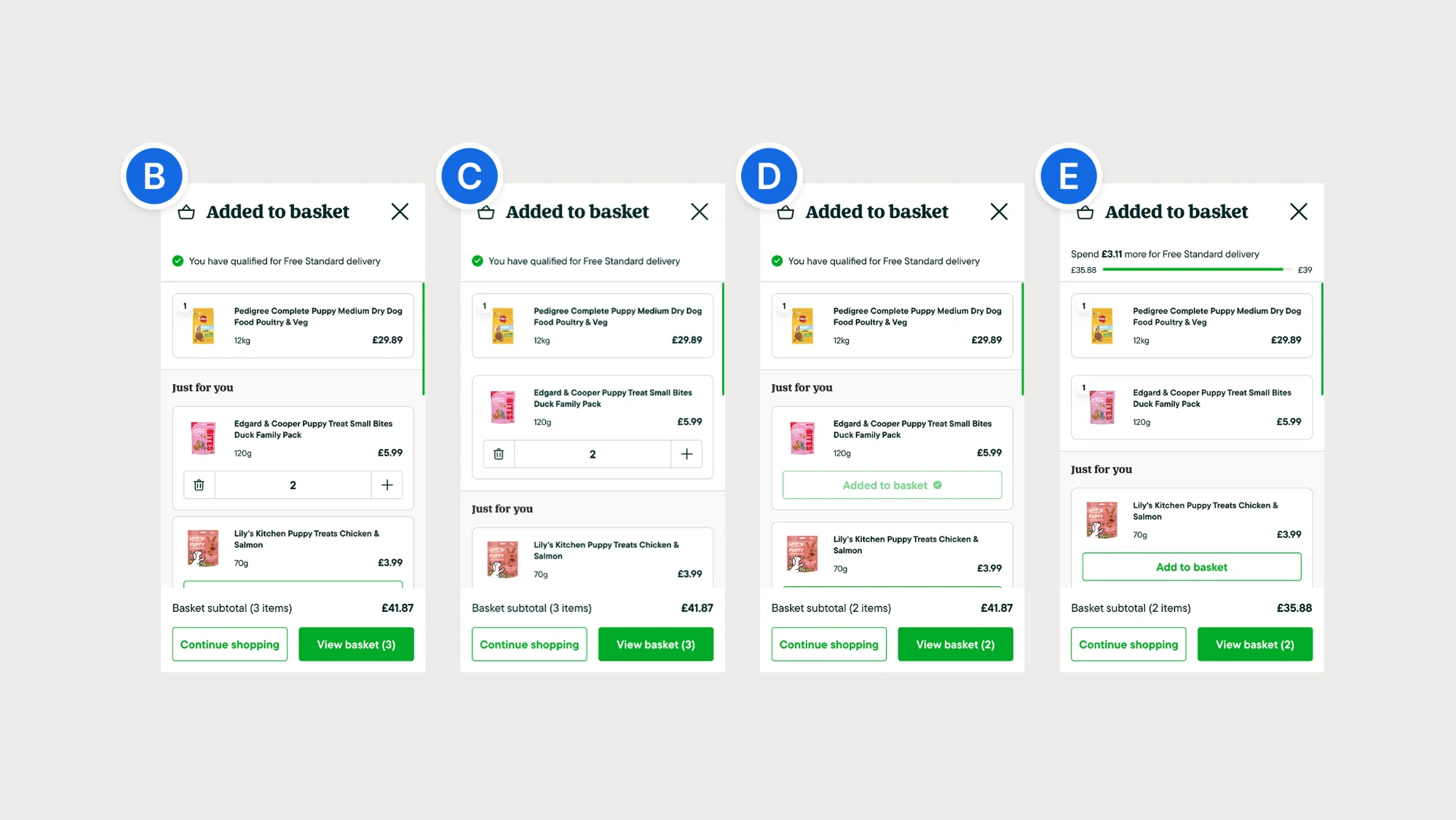
I built four fully functional prototypes using AI-assisted development. Each one tested a different combination of two variables: whether the product moves to the basket area when added, and whether users can adjust the quantity.
These weren't wireframes or click-throughs. They were working prototypes with real interactions, built with proper accessibility: ARIA labels, keyboard navigation, screen reader support.
Part of this was practical. I needed prototypes robust enough to test with assistive technology users. But I also wanted to see how far AI-assisted prototyping could go. Could I build something production-quality fast enough to ship within weeks?
The answer was yes.
Testing With Two Groups
Validating With All Users
I ran the research through usertesting.com with two separate groups.
Regular Customers
- Tested all four interaction variants
- Compared layout options
- Central modal vs side panel
- Standard usability testing
Assistive Technology Users
- Same prototypes tested
- Screen reader compatibility
- Keyboard navigation
- First time UX ran AT testing at the company
Key finding
Both groups pointed to the same winner. The assistive technology group validated that the interaction was clear and fully navigable.
Variant C + Side Panel
The Clear Winner
When users add a recommendation, the product moves up into the basket area. The "Add to basket" button becomes a quantity selector. The total updates immediately.
Users called it "straightforward" and "simple." The movement confirmed their action. The quantity controls gave them flexibility. Nobody got confused.
Try the Interactive Prototype
Experience the Winning Pattern
When users add a recommendation, the product moves to the basket area and the button becomes a quantity selector.
View Variant C Prototype →"I could see the item move into my basket, so I knew it worked."
"The plus and minus buttons were really intuitive."
"This feels natural, it's like ASOS or other sites I use."
Why The Others Failed
Two Rules That Mattered
The other variants each broke one of two rules.
Visual Feedback
- When users add something, they need to see it happen
- Variants B and D kept the product in place
- Users weren't sure it had worked
- "Where did my item go?"
Quantity Control
- Users expect to adjust quantities
- Standard e-commerce functionality
- Variants E and D removed this
- "I can't change the quantity!"
Variant C: Winner
Visual Feedback: ✓ Quantity Control: ✓ — Both requirements met. Clear, intuitive interaction.
Variant B: Confusing
Visual Feedback: ✗ Quantity Control: ✓ — Product stayed in place. Users unsure if it worked.
Variant E: Frustrating
Visual Feedback: ✓ Quantity Control: ✗ — No quantity controls. Users couldn't adjust amounts.
Variant D: Failed
Visual Feedback: ✗ Quantity Control: ✗ — Neither requirement met. Consistently rejected.
Variant C was the only one that delivered both.
The Results
What Happened After Launch
The minibasket shipped to web first, then app. Total time from proposal to live: one month.
£47
AOV across platforms
+42%
View Basket click rate
+18%
Continue Shopping revenue/click
5.7×
Recommendation click rate
Impact breakdown
Web: £45 → £46. App: £43 → £47. View Basket click rate: 4.83% → 6.87%. Continue Shopping revenue/click: £10.50 → £12.40. Recommendation click rate: 0.10% → 0.57%.
The combination of the free delivery progress bar and recommendations gave users both the motivation and the means to add more.
What I Learned
Key Takeaways
Test with everyone
Including AT users in the research was a first for the team. It added confidence that the design worked for all users, not just an assumption based on guidelines.
AI-assisted prototyping is production-ready
I built four accessible, functional prototypes fast enough to test and ship within a month. This workflow is now part of how I approach problems.
Small interventions can move meaningful metrics
This wasn't a full redesign. It was a focused change at a high-value moment in the journey. Two features working together, details tested properly, shipped fast.