The Opportunity
A £57M Problem
In October 2025, 268,614 customers viewed their basket. Almost 120,000 of them left without clicking checkout. Only 8.79% returned organically to complete their purchase.
These aren't window shoppers. They've already decided to buy. They've found products, added them to their basket. Something at this final stage is stopping them.
44.6%
Left without clicking checkout
8.79%
Returned organically
109k
Unclaimed baskets per month
"No two users organised basket features identically — a clear signal of fundamental information architecture problems."
Rather than guessing at solutions, I proposed a structured research approach using Baymard Institute methodology. The initial audit revealed our current basket experience rated as "POOR" with a net score of -2.4.
£57M
Annual Opportunity
-2.4
Baymard Net Score
5
High-Impact Violations
Research Methodology
Evidence Over Assumptions
I combined quantitative analysis with qualitative research methods to build a comprehensive picture of user behaviour and pain points.
Baymard Audit
I audited the current basket against Baymard Institute guidelines. The result: 6 high-impact violations and only 2 areas meeting best practice.
The major violations included no save for later functionality, no undo option for removed items, dropdown quantity selectors instead of +/- buttons, inability to edit product variants in the cart, small product thumbnails making it hard to verify items, and missing free shipping threshold information in the order summary.
The page did meet standards in two areas: showing the full order cost including delivery at the cart step, and keeping the discount code field collapsed behind a link to avoid distraction.
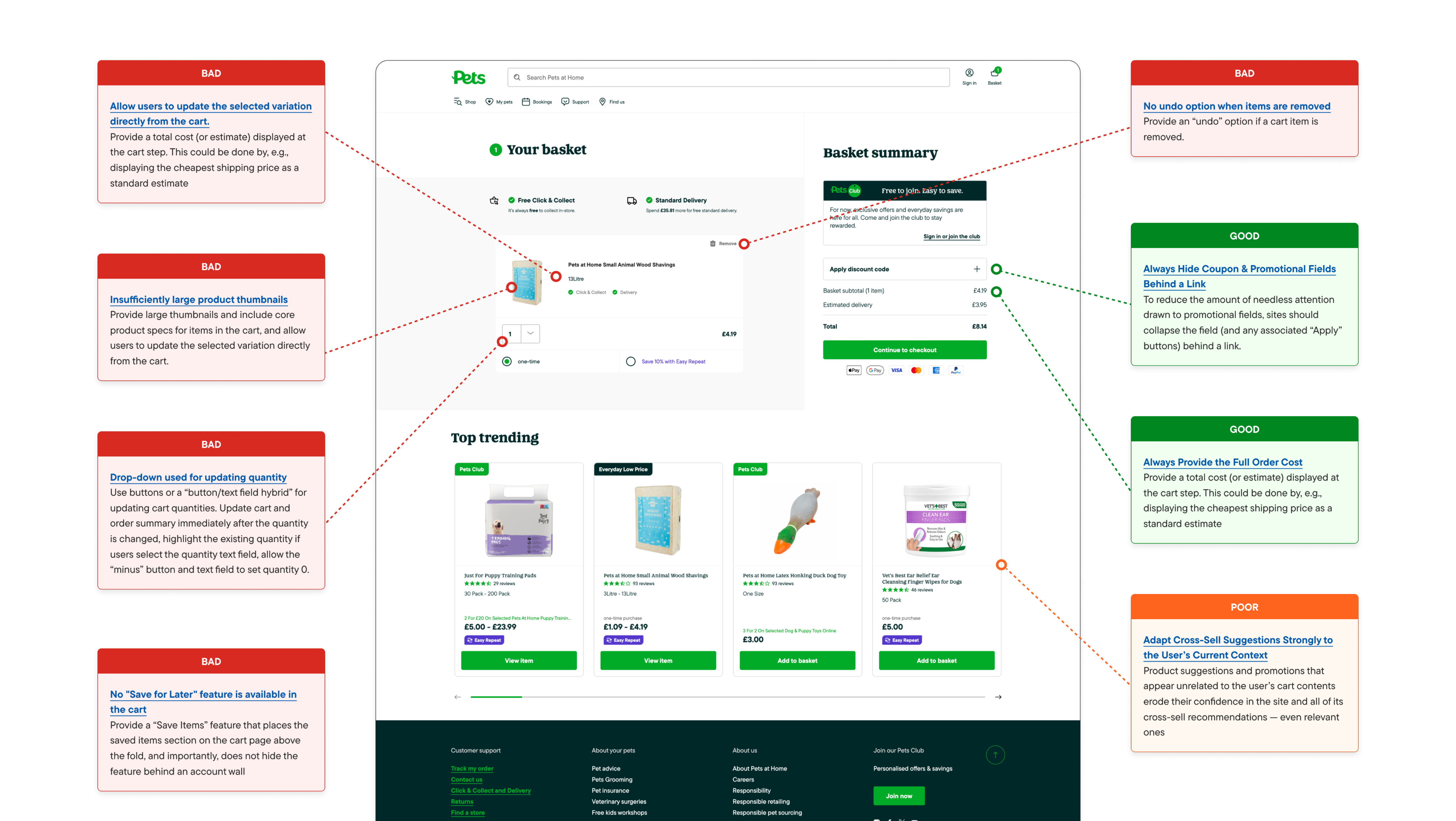
The Baymard verdict
Current rating: Poor. The goal is to reach Perfect by addressing all identified violations in the redesign.
Competitor Analysis
16 pet retail sites analysed against 11 UX criteria. Built a tool with Claude Code to automate the process. What would have taken weeks took days.
Feature Importance Rankings
Asked users to rank 10 basket features by importance. Checkout CTA and Basket Totals ranked #1 and #2. Neither is prominent above the fold on our current page.
Card Sorting
Tested how users naturally group basket features. No two participants organised them the same way, revealing fundamental information architecture problems.
Key finding from competitor analysis
Subscription options are absent from 60% of competitors. Express checkout options and delivery timing information are also weak across the market. These are opportunities to differentiate, not just catch up.
Design Process
Research-Driven Design
This isn't a redesign for redesign's sake. Every change in the prototype relates directly to Baymard best practices, competitor analysis findings, or user research. Engineering was involved from the start to ensure feasibility.
Step 1
- Wireframes
- Focus on information architecture
- Detailed annotations
- 4-6 basic layouts
Step 2
- Lo-fi Prototype
- Basic interactions
- Internal testing
- Refine based on feedback
Step 3
- User Testing
- Usertesting.com validation
- Identify pain points
- Confirm patterns work
Step 4
- Hi-fi Prototype
- Full React implementation
- Accessible, configurable
- Ready for A/B testing
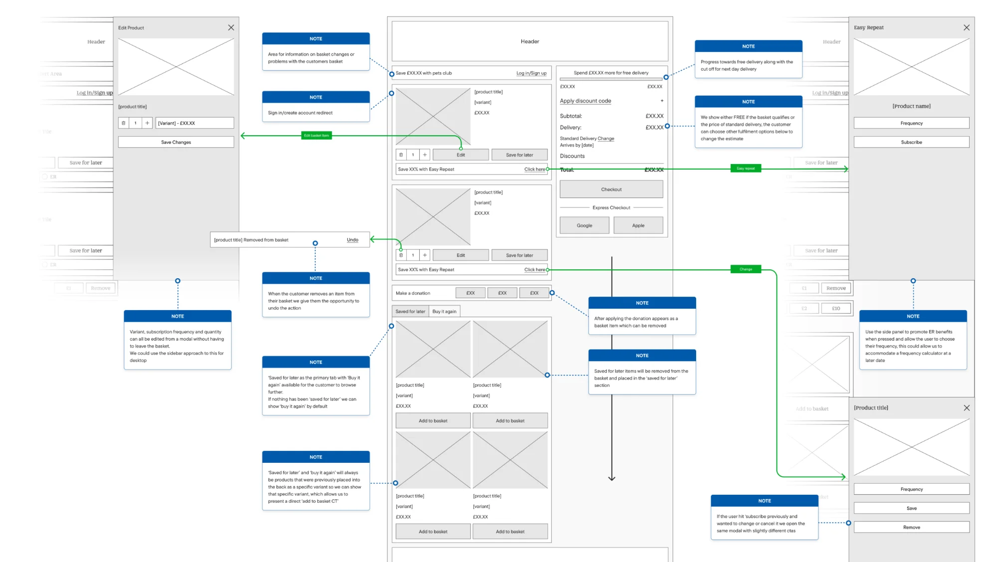
I started with 4-6 basic wireframes focused on information architecture before moving to interactions. The wireframes were built with detailed annotations explaining the rationale for each decision.
User Testing
Validating the Approach
The lo-fi prototype was tested on usertesting.com and internally. The feedback validated the approach and highlighted areas for refinement.
Intuitive and pleasing to use
"It's the sort of checkout, website checkout thing I would be pleased to use because it's just very intuitive." — Jorvik, usertesting.com
Edit products from the basket
"I really like the option to edit the product and change the size from within the basket rather than having to go out and find the product again." — Devastated, usertesting.com
Simple and effective
"From an end user perspective, it was really simple. It was really effective." — Devastated, usertesting.com
Impressive delivery options
"I was really impressed with sort of being able to add the delivery choices that you wanted. It reflected it all on the system and updated accordingly." — Taketest, usertesting.com
Actionable feedback
One user noted that "Save" as a label was unclear: "I wouldn't really know that would be to take the product away. Maybe if there was a clearer way of saying that with sort of language." This kind of feedback drives iteration.
The Prototype
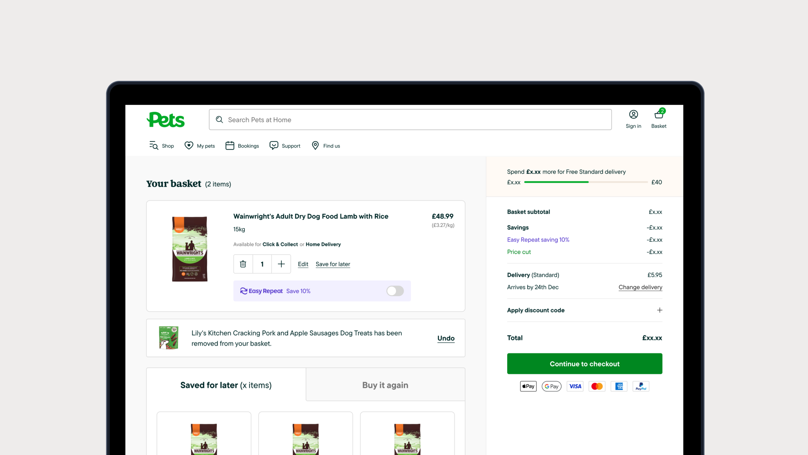
Production-Quality Build
The hi-fi prototype isn't a static design. It's a fully functional, accessible React build with real interactions and configurable variants for A/B testing different approaches.
Key features include full checkout flow, save for later, subscription setup, delivery method selection, variant/quantity editing, free delivery progress, undo functionality, and complete responsive design with accessibility built in.
Try the Live Prototype
Experience the Complete Redesign
The prototype is fully interactive and demonstrates the complete basket experience with configurable variants for A/B testing.
View Live Prototype →Implementation
The Path Forward
The next step is user testing on the hi-fi prototype, followed by building an implementation roadmap. This won't ship all at once. It will be integrated piece by piece, with each change measured for impact.
The fix for basket persistence
The technical issue that started this investigation, basket persistence across sessions, is now in development. This paves the way for the abandoned basket email that originally surfaced the problem.